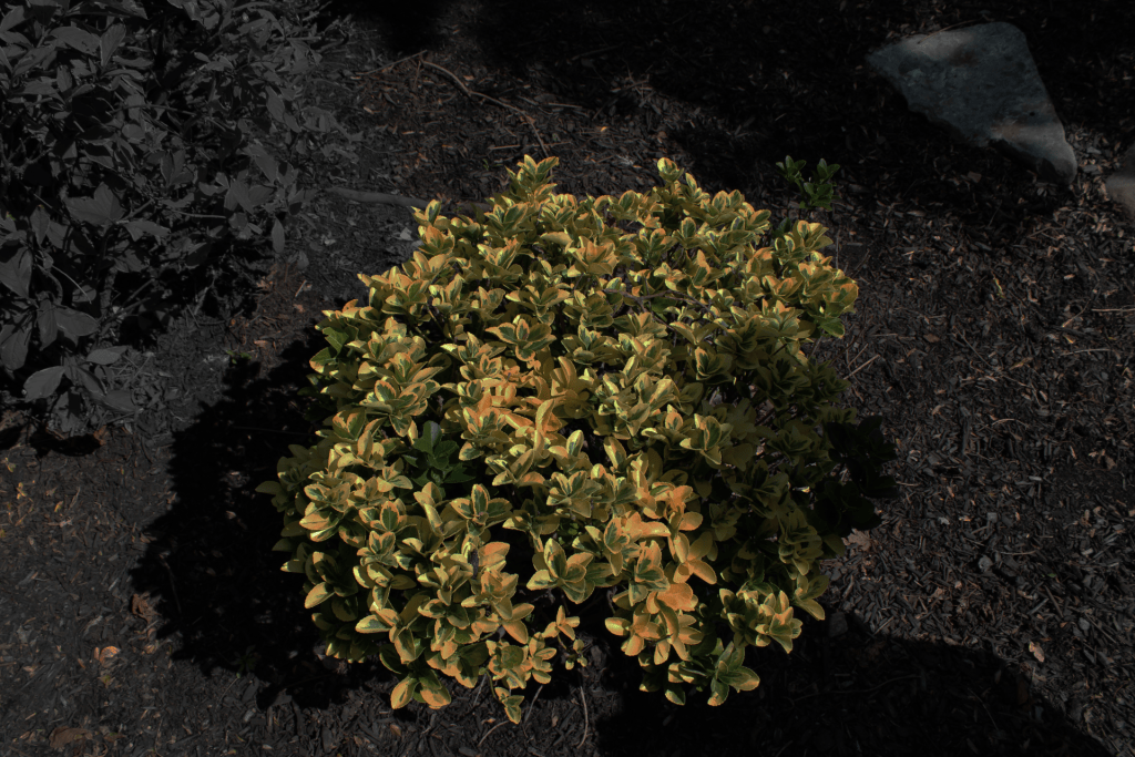
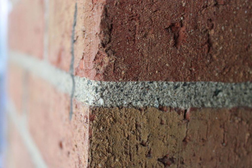
ColorGeometric shapeNatural lineTextureForm, 3D ShapeValue, Black and WhiteOrganic ShapeSmall depth of fieldSpace, closeupMan made line
A strength I see in my work is finding the right spots to take the photos, but my weakness is blurriness in the photos. Part of the reason why the photos get blurry are my hands not being still with the camera. Another reason to why photos can be blurry are not zooming in or out when I need to.
I can improve on this by keeping the camera still and using the lens more and often. Keeping my hands still can stop the photos from appearing rough or sloppy. Using the lens more can increase the look of my photos by the lens being more zoomed in or being zoomed out which can help the angle of my photos.
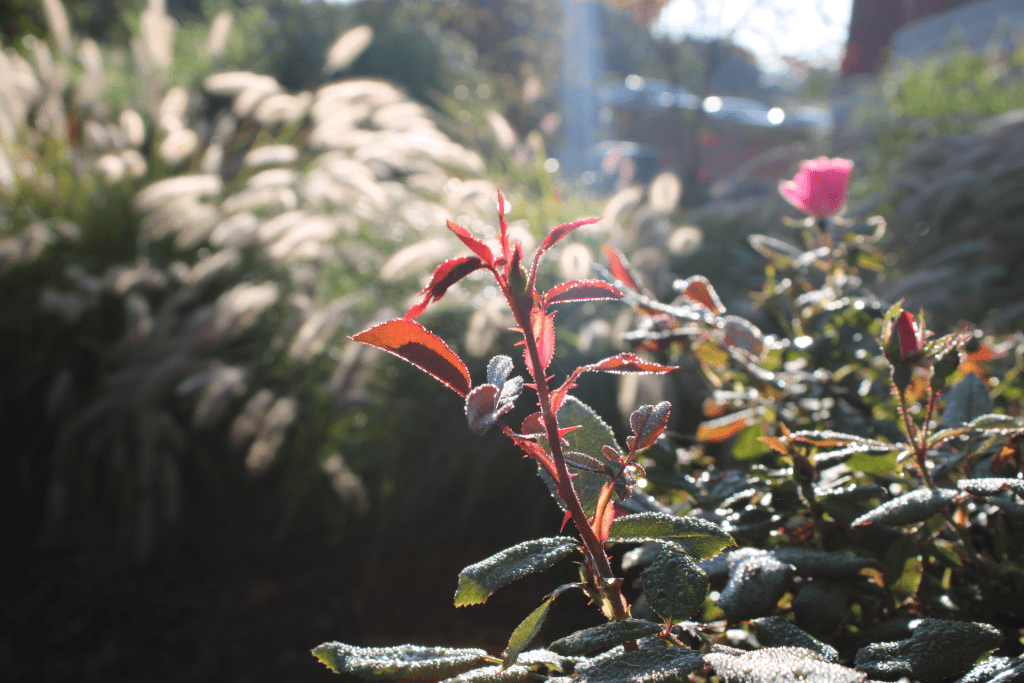
In the photo form, 3D shape I wanted to convey the emotion of beauty in color. The parts of red on the end of the flower bring out the color and are the highlight of the photo. The water drops show a sense of stillness and the thorns on the flower can resemble the sharpness of the photo.
A couple elements I’d like to explore more in photography are line and Space. Line interests me because of how much line people see in their everyday lives. Line is everywhere and people don’t seem to recognize it. Space is my favorite element because I enjoy the closeups more than any of my other photos.
I want to experiment more with closeups in my future photos. Closeups interest me a lot because the photos to me look better than any other type of photo. The detail, the color, the water specs, no matter what it is these type of photos fascinate me.
3 thoughts on “09 Elements of Art”
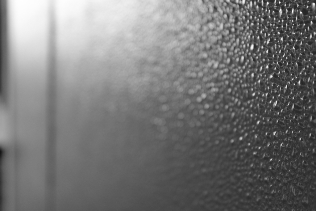
A picture that I really like is value, it starts then slowly fades away and it looks cool. The picture for form looks cool as well, the lighting is amazing and it makes the object look 3d. A photo that could be better is the man made line, there doesn’t look like there is much editing and I can’t tell which one is the actual line you are focusing on. I can see one composition technique being LEADING LINES from the tree branches going in to the trunk, you probably couldn’t have even seen it.
I think the pictures you took were amazing, and the colors that you captured and edited were aesthetic. In particular, the texture picture was great it showed very good detail and angle. I think your strengths are capturing value and texture. Keep up the good work!.
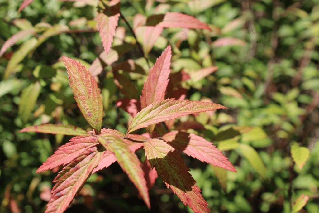
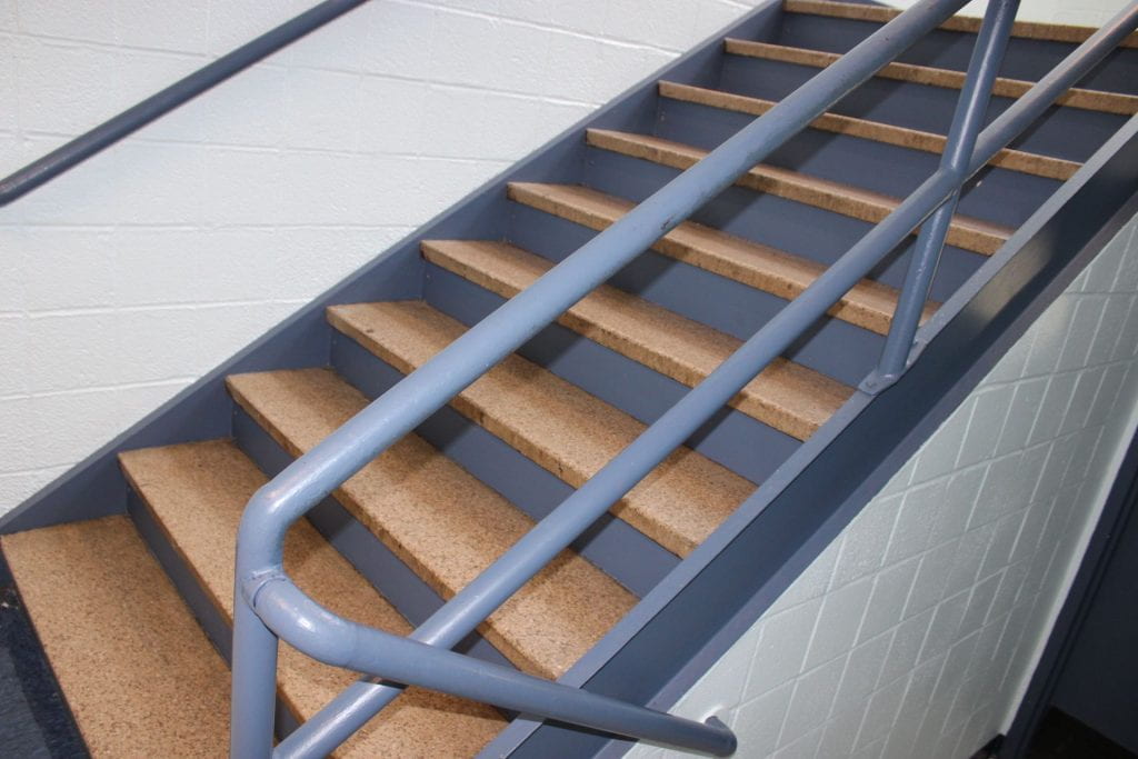
The best two photos in his blog are the “color” and the “form” pictures. I like the color picture because of how well the editing is and the angles. I like the form picture because I think it was taken in the perfect spot and angle. A better picture could be the man-made-line picture. It looks as if it was taken last minute with no effort. In one photo, the color picture, you can tell that Anthony used a pattern, everything is black and white and it is then disrupted by the yellow.
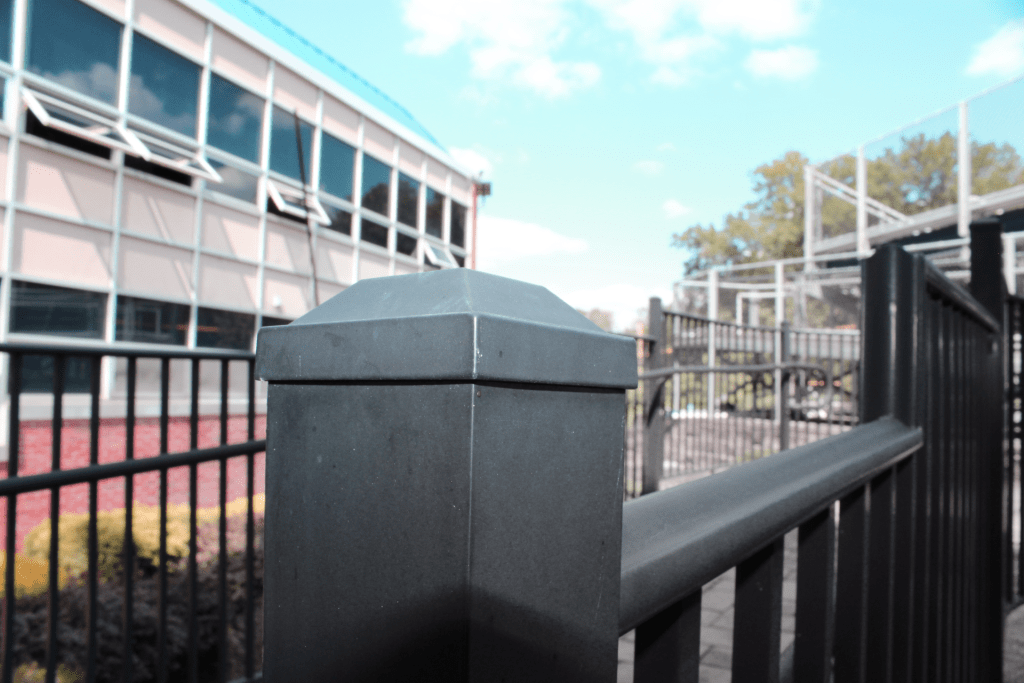
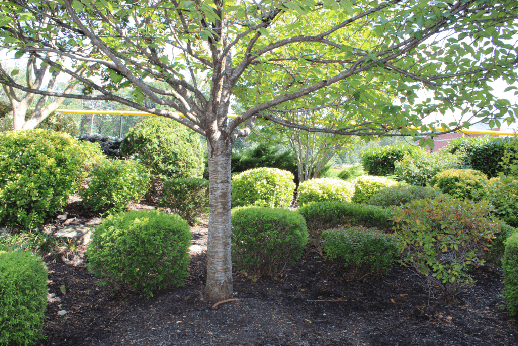

A picture that I really like is value, it starts then slowly fades away and it looks cool. The picture for form looks cool as well, the lighting is amazing and it makes the object look 3d. A photo that could be better is the man made line, there doesn’t look like there is much editing and I can’t tell which one is the actual line you are focusing on. I can see one composition technique being LEADING LINES from the tree branches going in to the trunk, you probably couldn’t have even seen it.
I think the pictures you took were amazing, and the colors that you captured and edited were aesthetic. In particular, the texture picture was great it showed very good detail and angle. I think your strengths are capturing value and texture. Keep up the good work!.
The best two photos in his blog are the “color” and the “form” pictures. I like the color picture because of how well the editing is and the angles. I like the form picture because I think it was taken in the perfect spot and angle. A better picture could be the man-made-line picture. It looks as if it was taken last minute with no effort. In one photo, the color picture, you can tell that Anthony used a pattern, everything is black and white and it is then disrupted by the yellow.